Tile-based selector where each option has its own image carousel. Supports single or multiple selection.
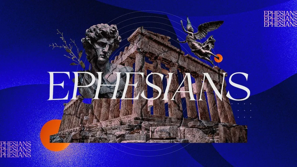
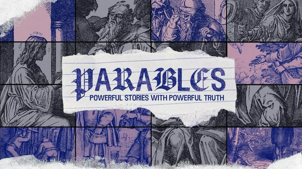
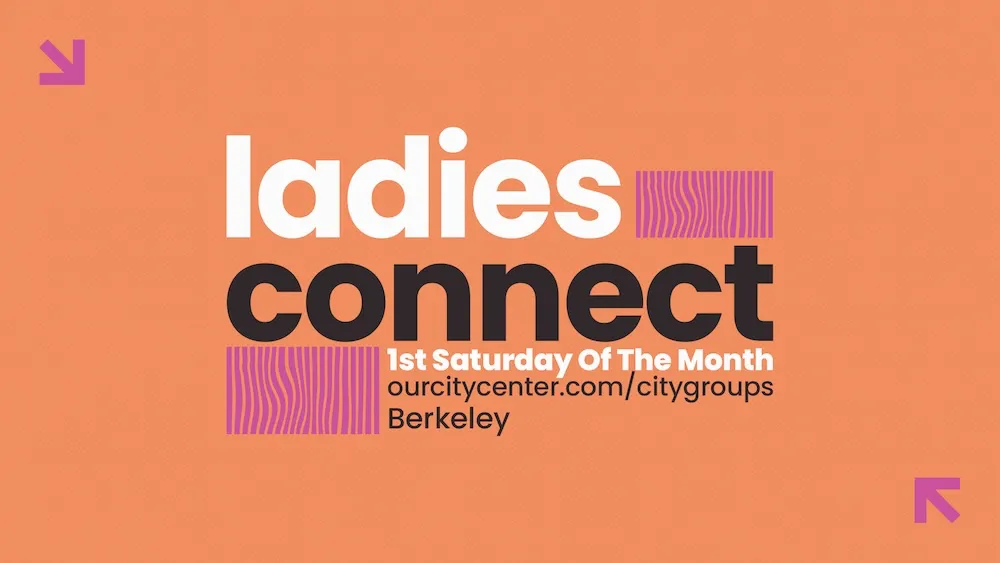
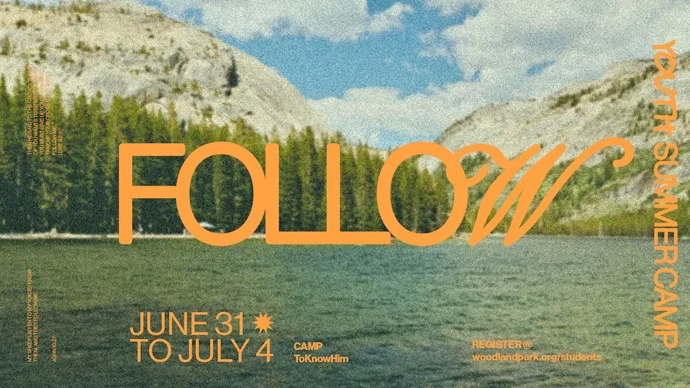
ExperimentalBold, innovative designs that push creative boundaries and challenge conventional aesthetics.
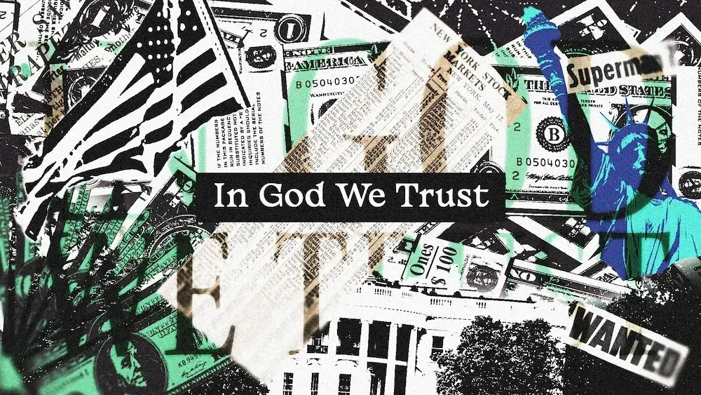
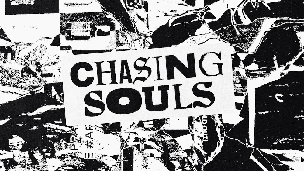
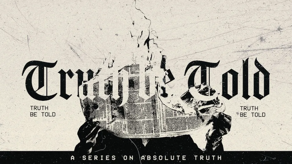
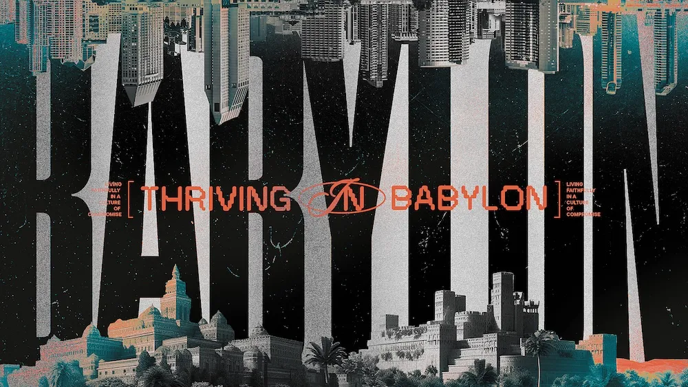
GrungeRaw, edgy designs with textured elements and a rebellious spirit that creates visual tension.

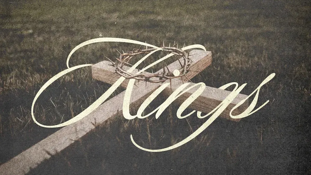
MinimalClean, simple designs that emphasize essential elements with plenty of white space for clarity.
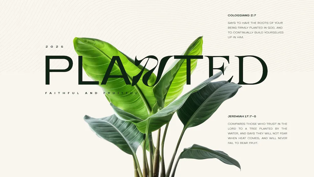
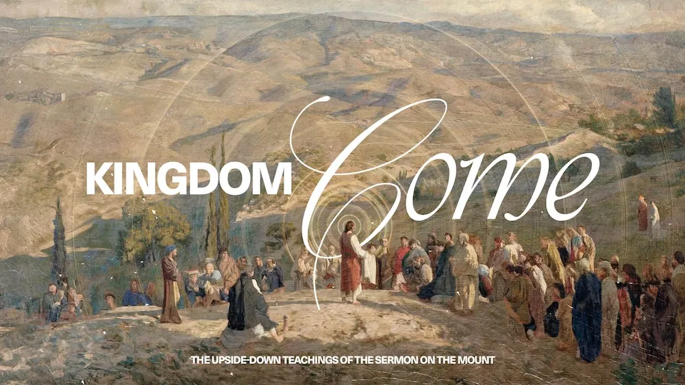


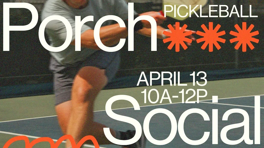
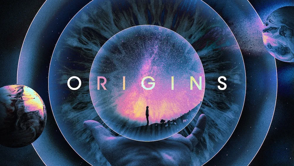
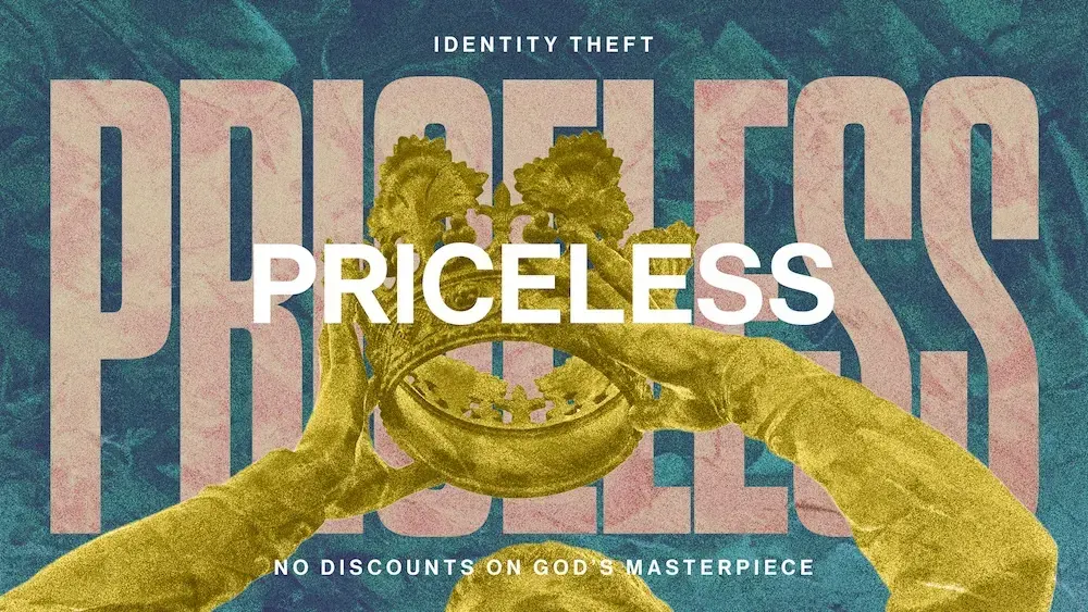
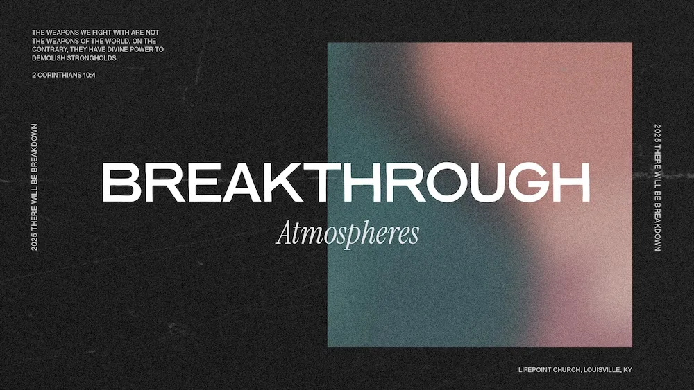
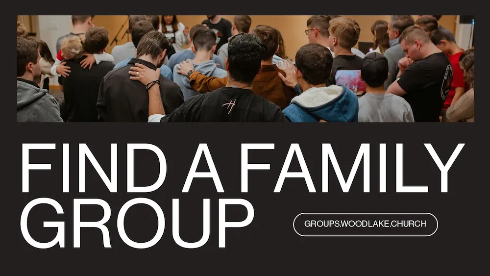
Photo DrivenDesigns that center around powerful imagery and photography as the main visual foundation.
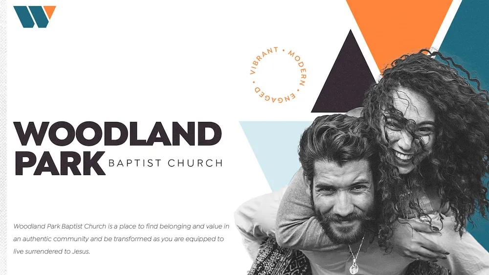

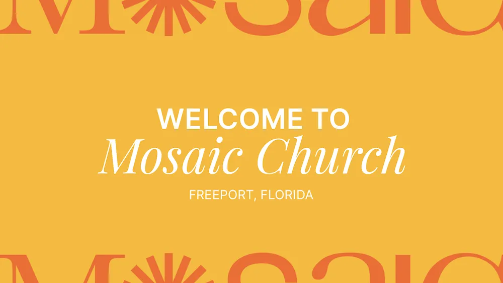
ProfessionalClean, corporate-friendly designs that convey trust and competence with structured layouts.
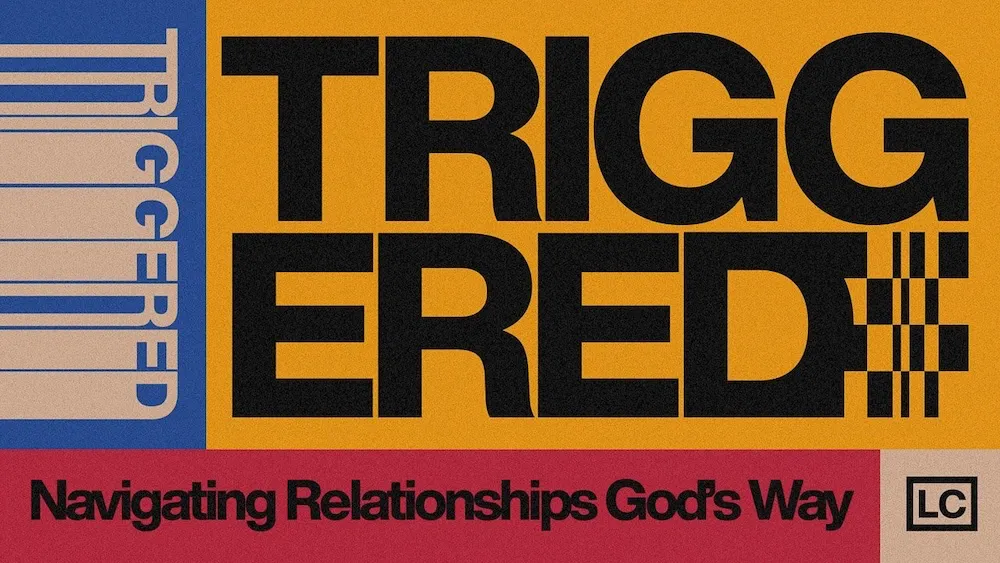

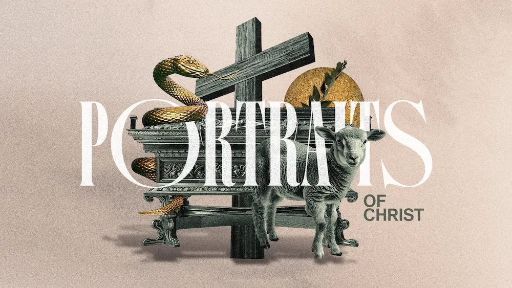
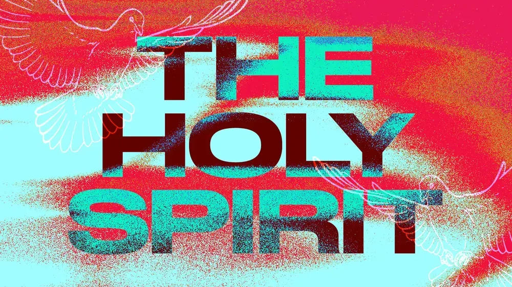
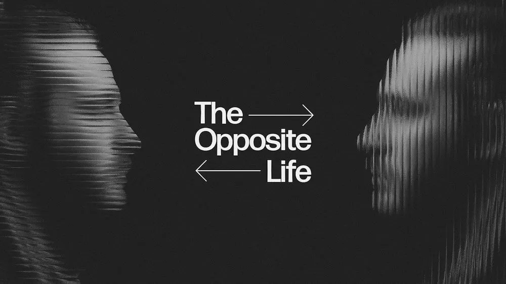
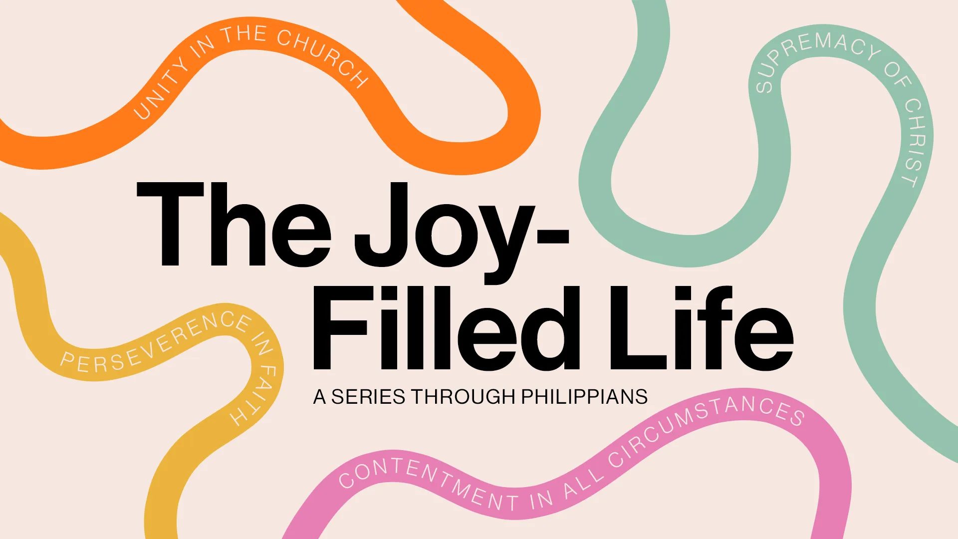
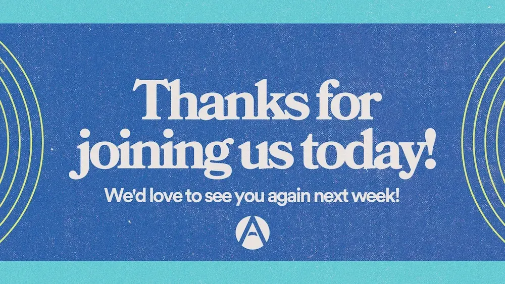
Type DrivenDesigns where typography takes center stage, using creative font combinations and dynamic layouts.
Auto-play carousels (single select)
Each tile cycles through its image set every 3 seconds.
ExperimentalBold, innovative designs that push creative boundaries and challenge conventional aesthetics.
GrungeRaw, edgy designs with textured elements and a rebellious spirit that creates visual tension.
MinimalClean, simple designs that emphasize essential elements with plenty of white space for clarity.
Photo DrivenDesigns that center around powerful imagery and photography as the main visual foundation.
ProfessionalClean, corporate-friendly designs that convey trust and competence with structured layouts.
Type DrivenDesigns where typography takes center stage, using creative font combinations and dynamic layouts.
Auto-play disabled
Static tiles with a pre-selected default.
ExperimentalBold, innovative designs that push creative boundaries and challenge conventional aesthetics.
GrungeRaw, edgy designs with textured elements and a rebellious spirit that creates visual tension.
MinimalClean, simple designs that emphasize essential elements with plenty of white space for clarity.
With disabled item
Individual tiles can be made non-interactive.
ExperimentalBold, innovative designs that push creative boundaries and challenge conventional aesthetics.
GrungeRaw, edgy designs with textured elements and a rebellious spirit that creates visual tension.
MinimalClean, simple designs that emphasize essential elements with plenty of white space for clarity.
Multiple selection
Checkbox variant; choose any number of styles.
ExperimentalBold, innovative designs that push creative boundaries and challenge conventional aesthetics.
GrungeRaw, edgy designs with textured elements and a rebellious spirit that creates visual tension.
MinimalClean, simple designs that emphasize essential elements with plenty of white space for clarity.
Photo DrivenDesigns that center around powerful imagery and photography as the main visual foundation.
ProfessionalClean, corporate-friendly designs that convey trust and competence with structured layouts.
Type DrivenDesigns where typography takes center stage, using creative font combinations and dynamic layouts.
With arrow navigation
Prev/next arrows appear on hover.
ExperimentalBold, innovative designs that push creative boundaries and challenge conventional aesthetics.
GrungeRaw, edgy designs with textured elements and a rebellious spirit that creates visual tension.
MinimalClean, simple designs that emphasize essential elements with plenty of white space for clarity.